
| Previous Page |
PCLinuxOS
Magazine |
PCLinuxOS |
Article List |
Disclaimer |
Next Page |
Inkscape Tutorial: More Text Tricks |
|
by
Meemaw I've seen a couple of things lately that might be useful to someone building some printed material. I do signs for work, plus a newsletter twice a year, so these might help me "dress things up" a bit. Adding A Gradient Davies Media design did a video on adding a gradient to your text, and I thought it was very interesting. Feel free to watch his video as well. Open Inkscape and add your text normally. This effect works best if your text is thick. I used a font called Impact. Make it large too... it will look good when you resize it smaller, but like most images, sizing UP tends to make images pixelated. It's not so noticeable with text but it's a good habit for you to adopt. I just used the name of our favorite Linux distro, and filled it with my favorite color. Then, opening the Fill and Stroke dialog, I chose Linear Gradient. The first effect I got was that the beginning of the text was the color I chose, and the gradient faded to transparent on the end. Grabbing the handles, I moved them so that the color was at the top and the transparent was at the bottom.  You can pull the handles as far out as you want to get your desired effect. If you want different colors, all the settings are in your fill menu. You can choose other colors, select a different color for a different stop, or even add stops. With the release of Inkscape 1.3 last summer, the gradient tools seem to be easier, at least for me. Everything you want to do with gradients is in the fill & stroke window and easier to get to.  You can see the color strips on the right, but there is a column on the left that shows your stops. (By color strips, I mean the colored bars labeled H, S, L, and A, where you adjust Hue, Saturation, Lightness and Alpha/Opacity). Now it's really easy to add a stop. At the bottom of the column is a plus and minus, to add or remove stops. You can also change the color of everything using whatever color management you want (choose it in the dropdown just above the color strips - HSL, HSV, RGB, CMYK, etc). Then, it's just a matter of adjusting the gradient's hue, saturation, lightness and opacity in the window, and adjusting the placement of the stops in your drawing. I added a stop to my gradient. If you only have two stops, the third will be in the middle. After that, the stop will be added above whatever stop you have selected (except for the end stops). You can select a stop and change the color in the window, or in the palette at the bottom of the main Inkscape window.  You can also add a gradient to your text stroke (outline). The cool thing is that the gradient window for that has the same choices, but allows you to add a completely different gradient to the stroke. On mine, the fill gradient is vertical, so the colors change from top to bottom (pink to almost white to blue), but the stroke gradient is horizontal, with the colors changing from blue on the left to pink on the right.  You can also make your gradient a radial gradient. Change it in the Fill and Stroke window, and adjust your stops. The radial gradient stops look a bit different, since you're going two different directions. You can adjust the length of each stop to make your gradient more elliptical or more circular. I made mine more elliptical and added a stroke gradient - linear - from dark blue on the left to lighter pink on the right. In the first image below, you can see the gradient stops.   I'm sure yours will be even more awesome. Image Fill Another way to change your text is to fill it with a picture or a pattern. Inkscape has patterns, but unless you add some, your choices are limited. However, if you have a pattern or photo you would like to use, you can still do it. Form your text in Inkscape. I used Arial Black, but you can use whatever you want. Again, if the text isn't thick, you won't see much of your photo. This time I wrote the flower name "Dahlia" because I have a photo of one. I imported my photo and placed it under the text. 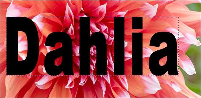 To fill the text with this photo, click Object > Clip > Set clip. If you find you don't like the way the photo appears, you can click the undo button, or Object > Clip > Release clip, then rearrange things to get the photo where you want it. Make sure the text and the photo are both selected, then set your clip again.  Most of this takes some experimentation, but I'm sure you can get the effect you want with either of these two methods. |