
| Previous
Page |
PCLinuxOS
Magazine |
PCLinuxOS |
Article List |
Disclaimer |
Next Page |
GIMP Tutorial: Pressed Text |
|
by Meemaw I saw this tutorial several months ago and thought it was neat. It makes a text that looks sort of like it was stamped into the background. I used the same pattern as the original, so I'm going to also try it with a different pattern to see how it changes.  So, let's go through it. I made my drawing 800 x 600 and my text Verdana Bold Italic, size 120 px. I used the name of everyone's favorite distro, but use whatever text you want. When you get your text written, change to the move tool and move it to the center of your canvas, then right-click the text layer and choose "Layer to image size". 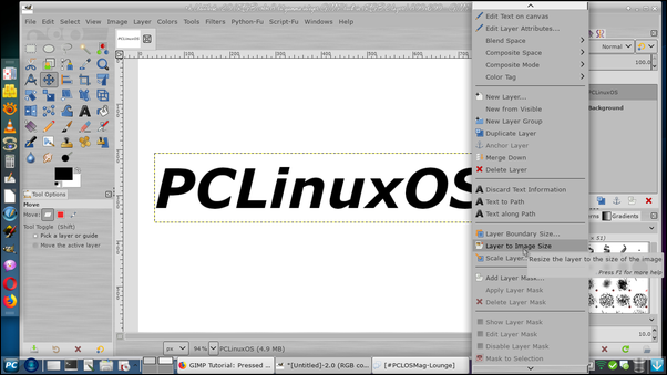 Now, choose only your text by right-clicking the text layer and choosing "Alpha to selection". Now your letters are outlined. The next step is to fill the letters with a pattern. Choose Bucket fill and change to pattern fill. Choose the pattern named "Pine?", and fill the letters. Now, add a drop shadow using Filters > Light and Shadow > Drop Shadow. (I used the legacy drop shadow tool.) Make your drop shadow offset 4 px. The next step is to fill our letters again. However, we want to leave that wood grain as a border, so go to Select > Shrink and shrink it 3 px. Now, choose your Bucket fill again, but change back to FG fill and use a gray color. Your letters should now be gray with a wood grain border. 
We're going to add another drop shadow, but it will affect the gray parts of the letters. Choose Select > Invert so everything else is chosen, then choose  Now, go to Select > None, then click on the background layer and fill it with the same pattern.  Now we can merge all our layers by clicking Image > Flatten image. We'll put the first of two gradients in now. Change to the Gradients tool, and choose a radial gradient, FG to transparent. Reverse the gradient as well, so the transparency is on the "left". 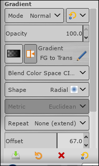 Now, start in the center of your canvas and draw your mouse pointer to the bottom right corner.  The next step is to do a bump map on this creation. Click on Filters > Light and Shadow > Lighting Effects. Click on the Bump Map tab and click the box that says Enable Bump Map. If our project had multiple layers, we would be able to choose which layer we wanted to use, but we only have one layer, so just click OK.  Let's add another gradient. If you click on your gradient tool again, your settings should still be there. Start in the center again and drag past the corner. If you've noticed, the drop shadow tool has left some extra at the sides of the project. At this point you can crop out whatever you don't want. I chose to crop a lot of my drawing, leaving just the text. Since it is your project, you can choose how much or little to crop. 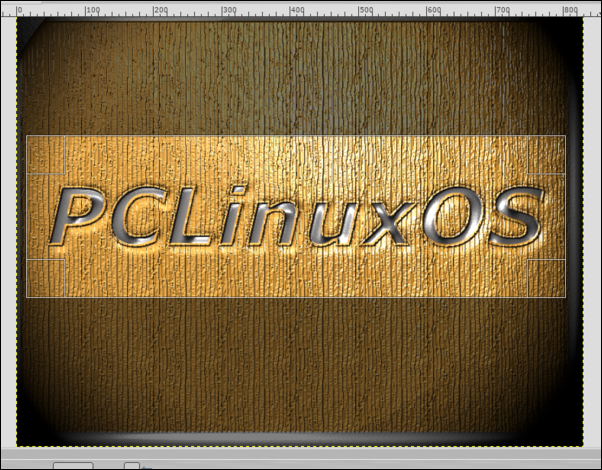 Neat effect, isn't it? I tried it again, using "Pastel stuff" for the letters and "Rain" for the background. It looks totally different. It may not appeal to everyone, but this is just another example of what can be done. 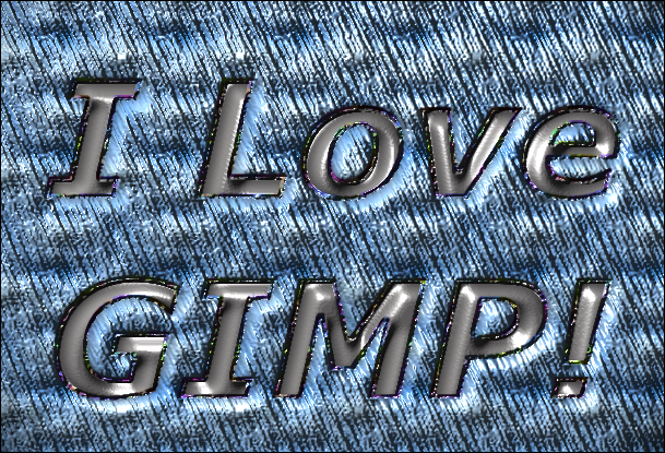
|