
| Previous
Page |
PCLinuxOS
Magazine |
PCLinuxOS |
Article List |
Disclaimer |
Next Page |
Inkscape Tutorial: How To Vectorize A Bitmap |
|
by Meemaw OK, say I'm creating a magazine cover and I just HAVE to use a certain piece of clipart. The problem is, when I enlarge it to the size it needs to be, it gets all fuzzy. For example, maybe I'm doing something for New Year's, and want to use this noise maker clipart:  However, for what I'm doing, it needs to be bigger:  Well, look at it now, kinda grainy and the edges aren't as smooth as the smaller image... is there anything we can do about that? We could vectorize it. Vectorizing it means that we will convert it from a bitmap to a scalable vector image, which can be resized without losing any quality. Scalable Vector Graphics are defined in a text file rather than with pixels, like many other graphics formats. When you enlarge a pixel graphic (the image up above is a png), the pixels enlarge, which allows the image to lose quality and get grainy. An svg, on the other hand, is described using an xml text file. The text will be exactly the same no matter how big you enlarge the image, so it definitely has advantages. So, can we convert this grainy thing to an svg? Yes! Let's do it! Open your image in Inkscape. Select your image, and click Path > Trace Bitmap. You'll see a window like this: 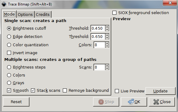 The first time will be a single scan, which will give us a black & white image (just for illustration). Make sure Brightness Cutoff is chosen (and check Live Preview if you want). You might have to play with the settings, but the default is pretty good, or you could go up to 0.500. Click OK. The svg will appear over the original, but I moved it to the right. 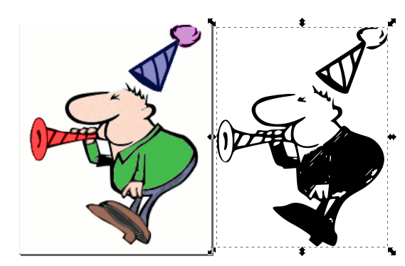 The black and white image can be saved as an svg. (Rats! I wanted a color image!) OK, let's do it again, and do multiple scans. In your Trace Bitmap window, choose Colors down under Multiple scans. Also, at the bottom, uncheck Smooth, as it seems to improve the quality. The selected image on the right is the trace. This can now be saved as an svg. 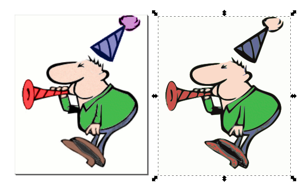 Look at the difference when I enlarge them both. The png is on the left. You can see how the png is fuzzy, but the svg isn't.  While the colors aren't exact (probably the person running the program rather than the program itself), they are very close, and the drawing edges are much smoother when the image is enlarged. While this particular image was fairly easy, I have found a few that are much harder. I think it's a matter of finding the right settings for the image you are using. If your image has a highlight on it, things are a bit harder. I did this globe as well. As you can see, the highlighted area looks choppy now, even with the number of layers increased to 30. I'll have to experiment with the settings more, but it seemed to smooth out when I increased the layers. 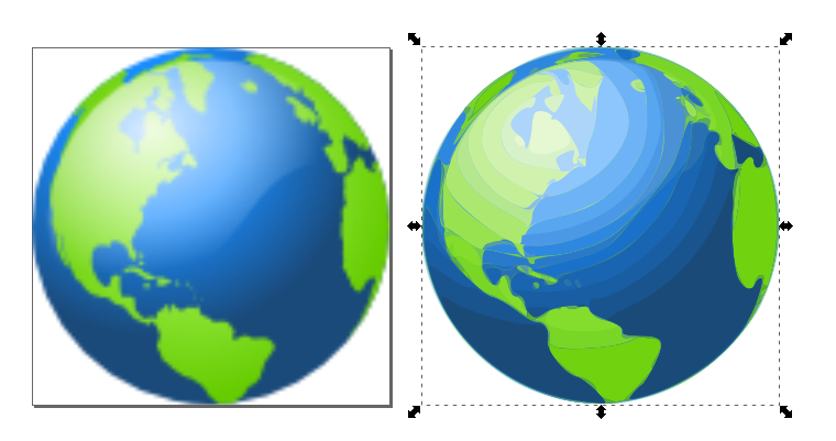 I hope this will prove useful to you. I thought it was fun besides. Your newly made svg's can be made as big as you need for your artwork. |