| Previous
Page |
PCLinuxOS
Magazine |
PCLinuxOS |
Article List |
Disclaimer |
Next Page |
GIMP Tutorial: Create Abstract Glass Art |
|
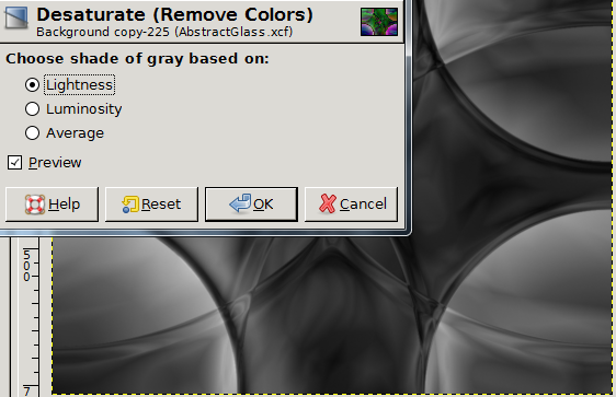
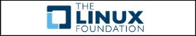
by Meemaw  I found this one on http://mygimptutorial.com/ and it looks really neat. It creates shapes that appear to be cut glass with light reflecting on and through them. This one takes a little practice as colors tend to blend more than you want them to. You can use different gradients and get different effects, but let's do the basic steps that resulted in the image above. Create a new image, size 1024x768, making sure the background is white. Select the Blend tool and set Mode to Difference and the Shape to Radial. The original tutorial used Land1 as the gradient, so we will do that. 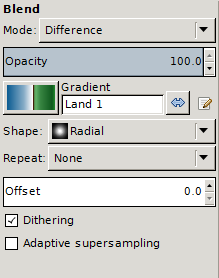 You will want to create eight gradients: one from each corner to the opposite corner. You can see I have already done 3 of those: 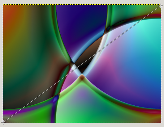 You also want one from each corner to the center. This one is my first: 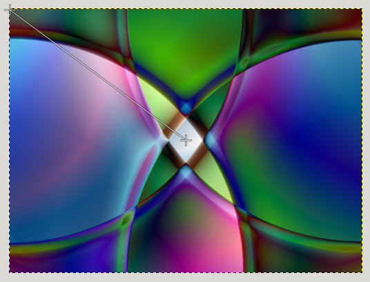 When you're finished, the image should look similar to this: 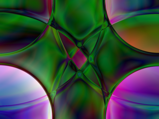 You might also notice that the color in your last corner is much brighter, so let's adjust the brightness there. In this one, my bottom left corner is too bright. Click on the Fuzzy Select tool, set the threshold to 45, and also enable Feather edges and set them to 5. Holding down the Shift key, click once in the corner:  Keep holding Shift and click on all the light areas in that corner until your selection looks similar to this:  Click on Colors > Brightness-Contrast. Set the Brightness to at least -60 and Contrast to at least 20. You might have to experiment to get your corners closer to even. I ended up setting mine to Brightness -75 and Contrast 30. 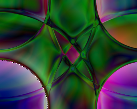 When it looks closer to the other corners, then click on Select > None to go back to the entire drawing. Just in case you also have a corner that is too dark, you can use the Fuzzy Select tool again. Set the threshold to 30 this time. Just like before, hold the Shift key and click until you have a selection like you had before. It might be a little more difficult. If it wants to select more than you need (like parts of the center), set your threshold down a little bit and try again. This time set Brightness to at least 70 and Contrast to 45. My upper left corner was very dark, so I experimented a bit and ended up setting the Brightness to 80 and the Contrast to 30, and mine turned out like this: 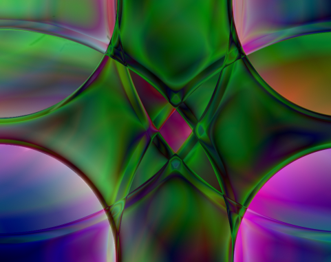 Again, click on Select > None. This might be a good time to save your work, if you haven't already. To make this look a bit more "glassy", let's add some blur to soften some of the edges. Click on Filters > Blur > Gaussian Blur and set the blur radius to 2. Now it should look similar to this: 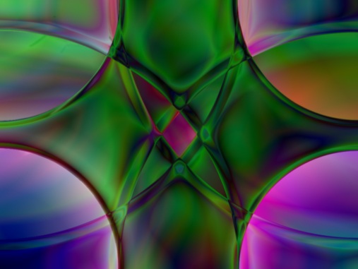 Now duplicate the layer. (In your layers dialog, click on the Duplicate Layer button.) Making sure you have the top layer selected, go to Colors > Desaturate.
The layer will be gray, so now select Colors > Colorize. Set the Hue to 100, and the Saturation to 60. This will give your image a nice green color, kind of like old glass. 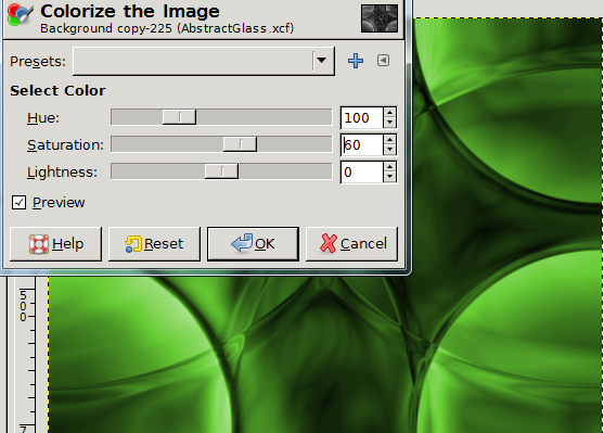 One last thing you can do is to lower the opacity of the green layer to around 75 (in the Layers dialog), so your background layer will shine through and make it look like it's reflecting colors through it. This is one you can experiment with, substituting other gradients (some don't work as well as others!), other colors in the colorize step and other gradient shapes. I tried one with the Radial Rainbow gradient and did the first four gradient paths (clear across the rectangle), then reversed the gradient and did one path from the center of the rectangle to below the image. Surprisingly, I didn't have to lighten or darken anything. Then I duplicated and desaturated the layer, but then when I colorized, my hue was set to 360 and Saturation down to 40 or 50. I then set the opacity of the layer to 90. Here is my result. Weird, huh? Definitely not as "glassy". 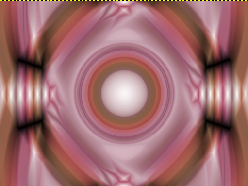
|