
| Previous
Page |
PCLinuxOS
Magazine |
PCLinuxOS |
Article List |
Disclaimer |
Next Page |
Inkscape Tutorial: More Text Tricks |
|
by Meemaw It seems you can make practically any text design you want, and this tutorial taught me a lot I didn't know! I add text to many of my projects, and I always used the Text window to edit my text (correcting a misspelled word, changing the font and size, etc.), but I hadn't really paid attention to the toolbar that is directly above my work area. I found out that you can use text window (the "T" at the top of the window), but the toolbar just below it has more options ... many things can be done just using this toolbar  Going from left to right, we start with the normal settings: Font, Font Size, Font Style (Normal, Bold, Italic or a combination) and Alignment buttons. We even have two buttons for superscript and subscript, if needed. From there, however, we have six settings that can really make your text look different. Let's concentrate on this half of the toolbar.  The first one is line spacing. This is useful if you have more than one line of text. Inkscape's default is 1.25. Depending on how you set it, you can put letters right on top of each other (with a negative setting) or space them far enough apart that something can be put between them. One use for this could be the award certificates that some schools give to children. If you have a two-line statement, you can space it out enough to leave room for someone to write in the child's name. If you design your own certificates, this may work better for your spacing than using the Enter key several times in a row. 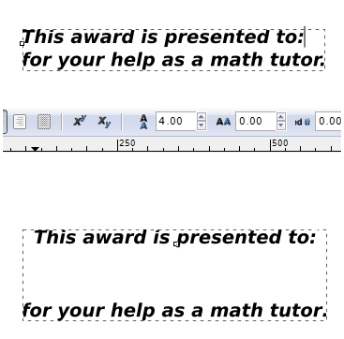 The second is letter spacing. This setting determines how close or far apart your individual letters are. A negative setting "smooshes" letters closer together, and a positive setting stretches the words out, as shown below. The center image is a zero setting, or "normal". This works well if you want to make a banner fitting a precise length. 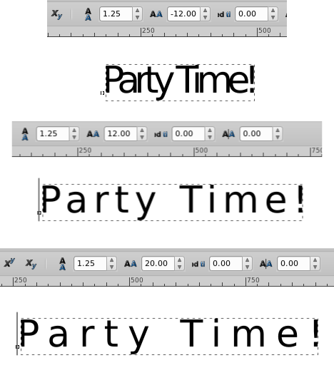 The third of the settings is word spacing. You can stretch your sentence out as much as you want by increasing the space between each word. This might help on your banner design, or a newsletter headline or ad you want to emphasize. 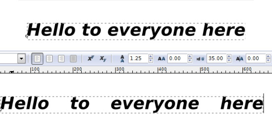 The fourth one is kerning. This adjusts the letter spacing only between the letters you've selected (putting the cursor between the letters you want to space out). As you see below, I separated the "e" from the rest of the word "Time". 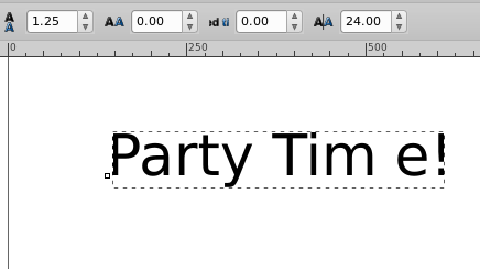 You can change the kerning on each letter individually to get a different look. If you play with it a bit and decide you don't like it, you can use the Undo function (<CTRL> + Z) which will undo them one at a time, or choose Text > Remove Manual Kerns to remove them all. Shift is next. Shift moves letters up or down. Place the cursor to the right of the letter you want to move, then change the setting. A positive setting moves it up and a negative setting moves it down. 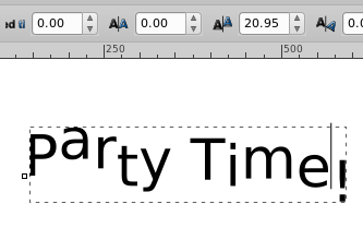 Rotation is the last number setting in the toolbar. You can rotate the letters one at a time by placing your cursor to the left of the letter you want to rotate, then changing the setting to a positive or negative setting in degrees. You can also highlight each letter and change the color. I did the colors and rotated all of these. The rotation setting is zero because no letters are highlighted. 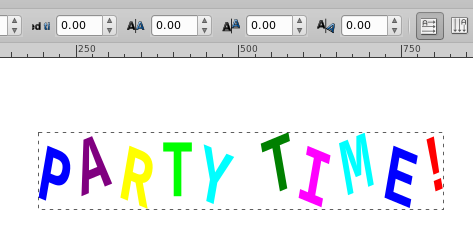 The last two buttons are text direction buttons. Most of the time you will want your text to run horizontally, but occasionally you might want vertical text. Choose your text tool and type it in as usual. If you forget, just highlight it and click the button and your text will change. 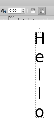 Another way to edit your text is to use the path effect editor. Change your text to a path (Path > Object to Path), then click Path > Path Effects. Add the effect you want (Bend, for example). In the Path Effects window, choose the edit on canvas tool (the node tool symbol) and you will get a line in your text to manipulate, just like moving nodes. On this one, I grabbed the center of the line and pulled it up. 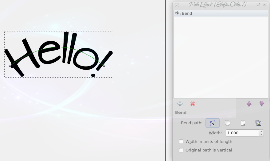
Another path effect is the envelope, which we covered in the December issue.
|