
| Previous
Page |
PCLinuxOS
Magazine |
PCLinuxOS |
Article List |
Disclaimer |
Next Page |
GIMP Tutorial: More Photo Editing Tricks |
|
by Meemaw I have a couple of wallpapers that I like very much, probably since I have been to the location pictured. Several years ago, I downloaded a wallpaper of "The Mittens" in Monument Valley in southeast Utah, USA. Then, I went there during a trip to Utah several years ago, and took one of my own. As you can see, the wallpaper I downloaded, on the left, is much more colorful than the photo I took, which is on the right. Bear in mind, the original photo on the left may have been a little more dull as well, until the photographer enhanced it. 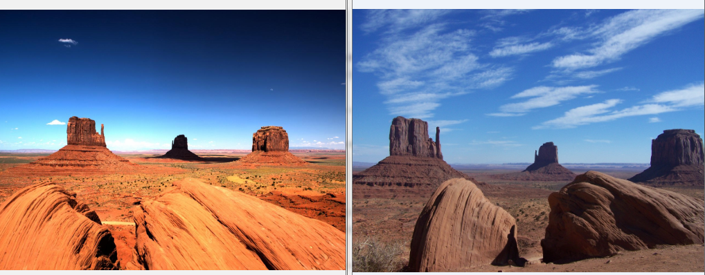 So, how am I to brighten up the one on the right? Let's use GIMP. Choose a photo you want to edit, and open a copy of it in Gimp. Navigate to Colors and select Levels. You'll see a histogram, which tells you how the pixels are distributed. If most of the black in the histogram is to the left, then your image is probably dark and underexposed. If they're to the right, then the picture may be too bright. A perfect shot will show most of the action in the middle. Mine had some in the center but lots in the right. Grabbing the arrow on the right and moving it left cleared up my photo a little. 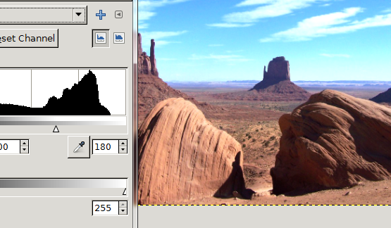 Now let's navigate to Filters > Enhance > Sharpen. The more you sharpen the image, the more detail you can see, but be careful! I went too far with the sharpen and almost had white detail spots on top of everything and white outlines around objects. Reducing the setting solved that problem. 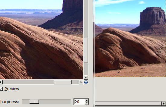 I also used Colors > Color Balance. I had way too much brown in the image, and that location really isn't dull brown, but many shades of orange. Be careful with this one as well, or you can drastically change the color of everything. Obviously I put too much red into this one because the clouds now have some purple in them that wasn't there before. Fortunately, all that is needed is to reduce the red setting in the color balance window. The arrow keys are very useful, as they allow you to make very small adjustments to get the color you want. 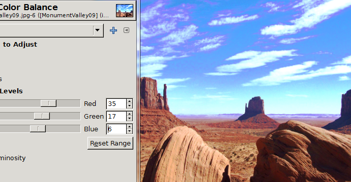 Colors > Brightness and Contrast can also help to brighten up your image. Just make tiny changes. 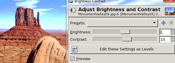 I went back to Color Balance and then Levels and played around a bit more. I am happier with it, but I think I can do better. You can see the before and after photos below. 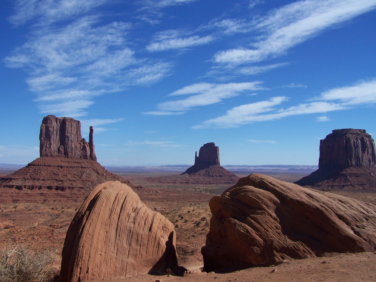 Before (above) and After (below) 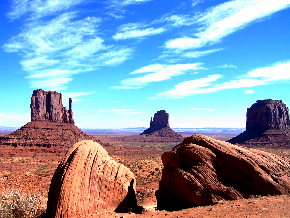 It is much more colorful than the drab brown photo was. Make sure you keep the original of your photo and only work on a copy. Since every photo is different, there are no absolute settings that will work on everything. The best way is to experiment with the setting until it looks right to you. Don't forget you can undo each change (<CTRL> + Z) if you don't like it. With a little more practice, I'm sure I can get it right quicker ... and you can, too! |