
| Previous
Page |
PCLinuxOS
Magazine |
PCLinuxOS |
Article List |
Disclaimer |
Next Page |
Programming With Gtkdialog, Part Two |
|
by Pete Kelly (critter) In the last article, I demonstrated how to write some gtkdialog code that would produce a simple utility that actually worked, without having to know, in any detail, how the code worked. This time I am going to expand on that, and fill in some of the detail that will enable you to write simple code that does what you want, in the way that you want it to do it. I shall explain how to use some more of the widgets available in the gtkdialog repertoire, how to change their appearance, add functionality and to communicate with them. As we progress, it is inevitable that the requirement to have some scripting knowledge and experience would be beneficial, but not essential. If you follow through the articles, then you will acquire most of these skills along the way. The examples shown all use a minimal shell 'wrapper' to keep things a simple as possible. We have seen how to produce a dialog with both pre-defined gtkdialog buttons and user configured buttons, which were placed inside frames, hboxes and vboxes. The theory First some theory, although if you find this boring and difficult to understand then please feel free to jump ahead to the examples. You can always come back if there is something that you don't understand. The gtkdialog button has to be placed into a container. This is mandatory. The container is often placed inside a window widget. Containers are usually vboxes, hboxes or frames, and these may be freely mixed, much as putting plastic bags inside plastic bags into a freezer compartment. Each plastic bag must contain either other plastic bags, widgets or a mixture of both. Between the compartments, we may have dividers, which may be dedicated horizontal and vertical divider widgets, or even empty hboxes and vboxes, which can also enable you to space items as required. Widgets may not be placed alone inside a dialog window. Widgets have: Attributes that describe their appearance within the container. Directives that describe how they should be presented and respond to user interaction. Signals which allow them to interact with other elements of the application. They are also subject to the application of functions upon them, subject to certain conditions being met.
The widgets This is not necessarily required, but it does allow you to control the position and size of the application, and to specify a window title and the icon that will appear on the window title bar and the taskbar. You can see how to do this at the beginning of the launcher application, code demonstrated in the previous article. Containers In our 2x2 button example, we had one vbox. All items in a vbox are arranged in a vertical stack. Ours contained 3 hboxes and 2 hseparators, which were stacked vertically in the order presented in the code. The vbox was sized automatically to accommodate all of its 'children' using the default sizes maintained by gtkdialog. The window was sized to accommodate the vbox. The items in the hboxes were arranged in a single horizontal row, again in the order presented in the code. These hboxes were sized to accommodate the number of widgets in the largest row. The hboxes with fewer widgets right-align their widgets which is why, in the bottom hbox, the cancel button appears on the right. This limitation can be overcome by adding the homogeneous=”true” tag to the container which will distribute all of the widgets equally. The following example does nothing but demonstrate the use of this tag. The window widget has been forced to a size that stretches the hbox to show the effect.
#!/bin/sh
export MYDIALOG='
<window width-request="400">
  <hbox homogeneous="true">

    <button help> </font>
      <action>EXIT:Help
    </button> </font>

    <button cancel> </font>
      <action>EXIT:Cancel
    </button></font>

    <button ok> </font>
      <action>EXIT:Ok
    </button> </font>

  </hbox></font>
</window>
'
gtkdialog --program=MYDIALOG
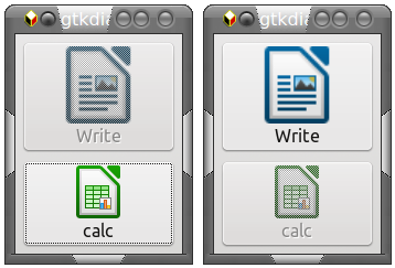
 Frames are also containers, but do not normally affect sizing (other than to add their own size). Frames are decorative and allow sub-grouping of widgets. All of this default sizing may be overridden. Buttons A button may contain a label, an image or both, and the position of the image is controlled by the image-position attribute (0 left, 1 right, 2 top, 3 bottom). The image size is controlled by the 'height' and 'width' attributes. When a button has the 'sensitive' attribute turned off, it is greyed out and does not respond to clicks. This property can be enabled or disabled by other widgets. A button can be given a name to enable it to be referenced by other widgets. This is performed with the directive 'label.' The example shows two buttons named 'wp' and 'ss.' Example: The writer button has sensitivity turned off on start up. Clicking the buttons toggles the state of the other button. Image position 2 puts the image centrally above the label. The word processor icon has been re-sized, but the spreadsheet icon retains the gtkdialog default dimensions.
#! /bin/bash
export MAIN_DIALOG='
<vbox>
    <button image-position="2">
        <input file>writer.png</input>
        <height>100</height>
        <width>70</width>
        <label>Write
        <variable>"wp"</variable>
        <sensitive>"false"</sensitive>
        <action type="enable">ss</action>
        <action type="disable">wp</action>
    </button></font>
    <button image-position="2"></font>
        <input file>calc.png</input>
        <label>calc</label>
        <variable>"ss"</variable>
        <sensitive>"true"</sensitive>
        <action type="enable">wp</action>
        <action type="disable">ss</action>
    </button></font>
</vbox>'</font>
 gtkdialog --program MAIN_DIALOG
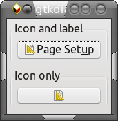
 Note that for these examples to work you must give the full path to the graphic files or copy them to the same directory as the script. In addition to the pre-defined buttons that I have already mentioned, gtkdialog provides access to a host of 'stock items.' These are icon-label pairs that may be used in buttons, menu entries and several other widgets. To get a look at what is available, try executing this script. /usr/share/doc/gtkdialog/examples/tree/tree_icon_stock_ids Just copy and paste the above line into a terminal and press enter. You should see something like this. 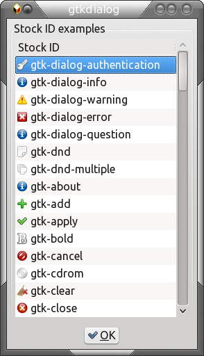 In a button, you may use both label and icon or just the icon, but the methods are different. An example will illustrate this.
#! /bin/bash
export MAIN_DIALOG='
<vbox>
  <frame Icon and label>
      <button use_stock="true" label="gtk-page-setup">
      </button>
  </frame>
  <frame Icon only>
      <button>
          <input file stock="gtk-page-setup"></input>
      </button>
  </frame>
 </vbox>
'
gtkdialog –program=MAIN_DIALOG
 Clicking a button triggers a 'signal.' The default signal for a button is 'clicked,' and this can be used to perform a function on another widget. In the next example, the 'write' button is hidden or shown, depending on its current state. The hide and show buttons do what their titles suggest to the write button. As the write button has no declared 'action,' clicking on it executes the default action, which is to terminate the script. 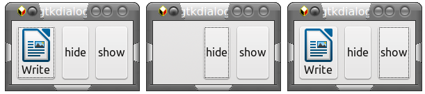
#! /bin/bash
export MAIN_DIALOG='
<hbox>
    <button image-position="2">
        <input file>writer.png</input>
        <label>Write</label>
        <variable>"wp"</variable>
    </button>
    <button>
        <label>hide</label>
        <action signal="clicked"
        condition="visible_is_true(wp)">hide:wp</action>
    </button>
    <button>
        <label>show
        <action signal="clicked"
        condition="visible_is_false(wp)">show:wp</action>
    </button>
</hbox>'
gtkdialog --program MAIN_DIALOG
Signals become more useful when used in dialogs with many different types of widgets. As an example, checking a checkbox widget might enable and give focus to a text input widget, or refresh the contents of a statusbar widget. There are many ways that you can modify the appearance and functionality of widgets, far too many to mention here, so I will just cover enough to make the widgets accessible for use in your scripts. Those that I have covered in the button examples will give you some idea of the flexibility of gtkdialog. For more detailed information, please refer to the links I provided earlier (in the previous article). Text You can put text into a dialog with the <text></text> tags. The text that appears in the dialog can be defined in these ways. <label>This is my text</label> Any static text. <input>command</input> The output from a command such as ls. <input file>filename</input> The name of a text file to display. If displaying the contents of a file and you include the tag_attribute <text auto-refresh=true>, then if the contents of the file are changed by some other process then the dialog contents will automatically be updated. The text can also be refreshed by using a button to execute the refresh function. This example overrides the default automatic sizing by submitting a width request of 300 pixels. It then displays the last ten lines of kernel messages through the command dmesg | tail. This text can then be updated by clicking the refresh button.
#!/bin/bash
export MY_DIALOG='
<vbox width-request="300">
  <text>
      <variable>MSG</variable>
      <input>dmesg | tail</input>
  </text>
  <hbox>
      <button>
          <label>Refresh</label>
          <action>refresh:MSG</action>
      </button>
      <button>
          <label>Done</label>
      </button>
  </hbox>
</vbox>'
gtkdialog --program=MY_DIALOG
 For the adventurous, there is the option to add text attributes, such as bold and color, through html type mark-up tags, and to provide updates through timers. The checkbox, radiobutton and togglebutton. Check boxes are used to get the user to choose or reject an option. Radio boxes are similar, but should be grouped, and only one member of the group can be selected at any time. The togglebutton is a strange animal used for switching between two states which is essentially what a single checkbox does. Perhaps I'm missing something, but I'll skip this widget, as I've never found a use for it. First the checkbox. Here we have two actions for each box. The first is executed only if the box is checked (true) and the second one, you guessed it, if the box is unchecked (false). Although this script only highlights icons, a usable script would include some code that actually manipulated the connection. We haven't seen the pixmap widget before. This simply displays a graphic, but the graphic has attributes than can be manipulated by other widgets. You should take care when assigning variable names and labels that you don't duplicate things, but that they are still descriptive. I have used a mixture of upper/lower case characters and spelling to make each unique. You should also remember to set the default state of each checkbox. The use of various containers in this example controls the layout of the application. 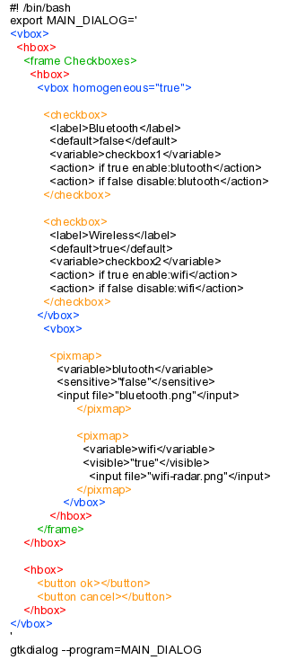 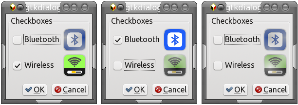 Now the radiobutton. All of the buttons are contained in a vbox, which relates them, and only one may be active. Selecting one of the group automatically deactivates the rest of the group. The vbox has the homogeneous attribute set to true to equally distribute the buttons within the same vertical space as the larger pixmaps. 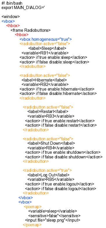 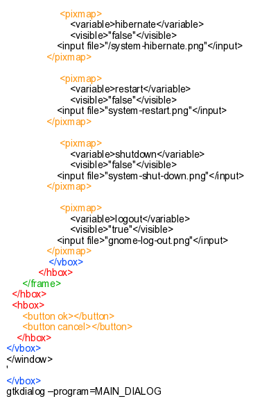 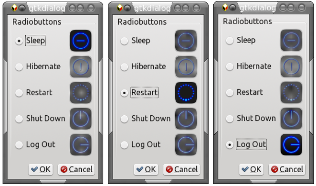 By using these few widgets, you can build some quite impressive utility applications with minimal programming experience. With a little bit of command line knowledge, you can assemble tools to match some of those that have already appeared in the PCLinuxOS repositories. That will help other users of the distribution, and will almost certainly put a self-satisfied smile on your face. Is there more to this gtkdialog? Oh yes! A whole lot more, which I shall start to demonstrate in future articles. |