Using Scribus, Part 2: Starting the Project
by Meemaw
In Part 1, we became familiar with some of the Scribus tools, learning how to open a new document and format the page. We also learned about frames and how to add a text frame and an image frame. Those are the basics to starting a poster, newsletter or brochure.
Since the majority of my work in Scribus is the magazine and the newsletter at work, we should go through the steps for creating a newsletter. (The magazine just has more pages). Before you start adding text frames randomly to a page, you will probably need to do a little planning. Decide on these beforehand:
- Page size – Is this something you are going to print out and mail? What size paper will be the best? For my newsletter at work, the answer is yes, they will be printed and mailed, and letter size is what I use.
- Orientation – Will it be more easily read in portrait or landscape? My newsletter is portrait, but since the magazine is read mostly from a computer screen, we find that the most popular orientation is landscape.
- Margins – You can make really small margins if you want, but if it is to be printed, your printer may not be able to print them, especially the bottom margin. You also want to stay away from filling up every available space on the page as it can make your newsletter harder to read.
- Design – Are you going to have some sort of title header on page 1? How big do you want it, and what will it look like? If you are printing it, will it be in color or just black?
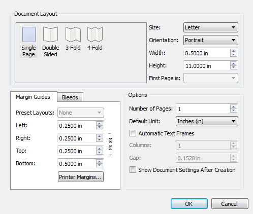
When you get an idea of your layout and design, it's time to start. For this article, the newsletter will be letter size, portrait orientation, with 0.25 inch margins and a small header on each page. The bottom margin will be 0.5 inch to accommodate my printer.
Open a new document, making it letter-size, portrait and 0.25 inch margins at left right and top, and a 0.5 inch margin at bottom..
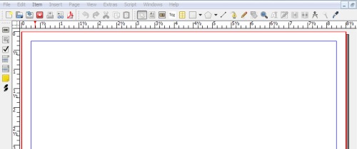
So, now our page is ready.
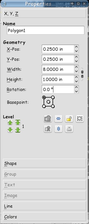
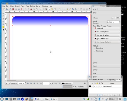
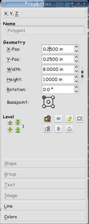
Newsletters can be just text, but a title header catches the reader's eye. Let's do a title header on the first page. Click on the shape tool, and draw a rectangle. In the Properties window, set the width to 8 inches and the height to 1 inch, the set the X-Pos and Y-Pos each to 0.25 inches (your margins). If you haven't named and saved your file yet, you should probably do that.
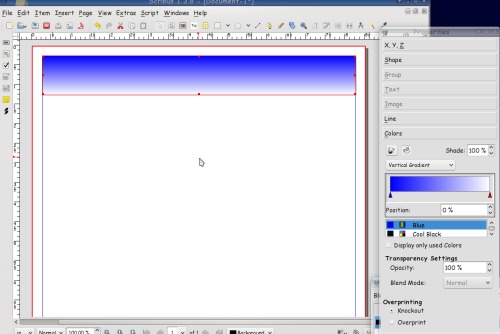
The default color is black. We want to change that, so click on Colors (at the bottom of the properties window) and assign a color. I used blue. Make sure the 'fill' button is clicked (looks like the pouring paint bucket.) You can also use a gradient; it is in the drop-down above the list of colors. The one I used was a vertical gradient. When you choose gradient, it opens another item, which is the box where you configure your gradient. Notice I have configured one 'end' of the gradient blue, and the other white. The red triangle under the gradient configuration tells which color you are changing. On a vertical gradient left is top and right is bottom. If you want a border too, you should click the 'line' button (looks like the paintbrush) and set it there. I set my border to None. (Save)
I wanted rounded corners on my rectangle, so I clicked on Shape in the Properties box, and set the measurement on Round Corners (top of window) to 0.3500. The higher your number is, the more rounded your corners will be.
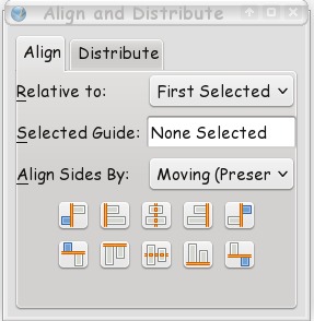
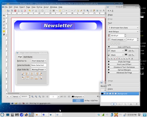
From there, I messed around a little more and made another rectangle, this time with a radial gradient. I wanted it in the exact center of the other gradient, so I clicked on Window > Align and Distribute so I can center everything. Click on the bigger rectangle first, then, holding down the Shift key, click on the smaller rectangle. In Align and Distribute, you will see 'Relative to' and a drop-down next to it. It should say 'First selected' -- if it doesn't, change it using the drop-down. The click on the two centering buttons (each in the center of their respective lines.) You can also choose to center an object on the page, changing the 'Relative to' drop-down to Page. (Save your work.)
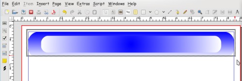
If you are happy with what you have done, you should lock it down so you don't move or resize it by accident. Click outside both rectangles, and drag a rectangle shape. You should be able to see a rectangle surrounding your header. Let the button up on your mouse, and you will see that both rectangles have been selected. You can select them one at a time like we did before, but if your hand shakes at all you may move one by mistake and have to go back and align again…
In your properties box, go back to X,Y,Z and you should see two buttons in the center that aren't grayed out. One has the outline of several shapes and the other is the lock. The first one is the 'Group' button, which you can use to make the rectangles into one item that is combined. When you do that you can move them both just by grabbing one of them. If you have a group you want to copy and use over and over, this is a benefit. Click on Group, then click on the Lock. The lock does just that – locks your item in place so it can't be moved or changed by accident. The icon will change from an open lock to a closed one. (Save)
Now we want our title. Click on the text frame button and make a rectangle over your header. Click on the 'Edit Text' button on the toolbar, or right-click in the text frame and choose Edit Text. There are many configurations in the Story Editor window but they don't always stay, so we do most of that from the Text section of the Properties window. You can do loads of things with your text. Choose your header, then your text and center the text, left to right, then lock it in place. You will probably get a message that some of you objects are locked. We know that because we locked the rectangles down earlier, so click on 'Skip Locked Objects' and the text will be centered in the rectangles. You also want to save your file again.
You can start adding text frames with news stories and image frames for pictures if you wish. Next month we'll explore more of how to get our newsletter looking the way we want.